Poker Face

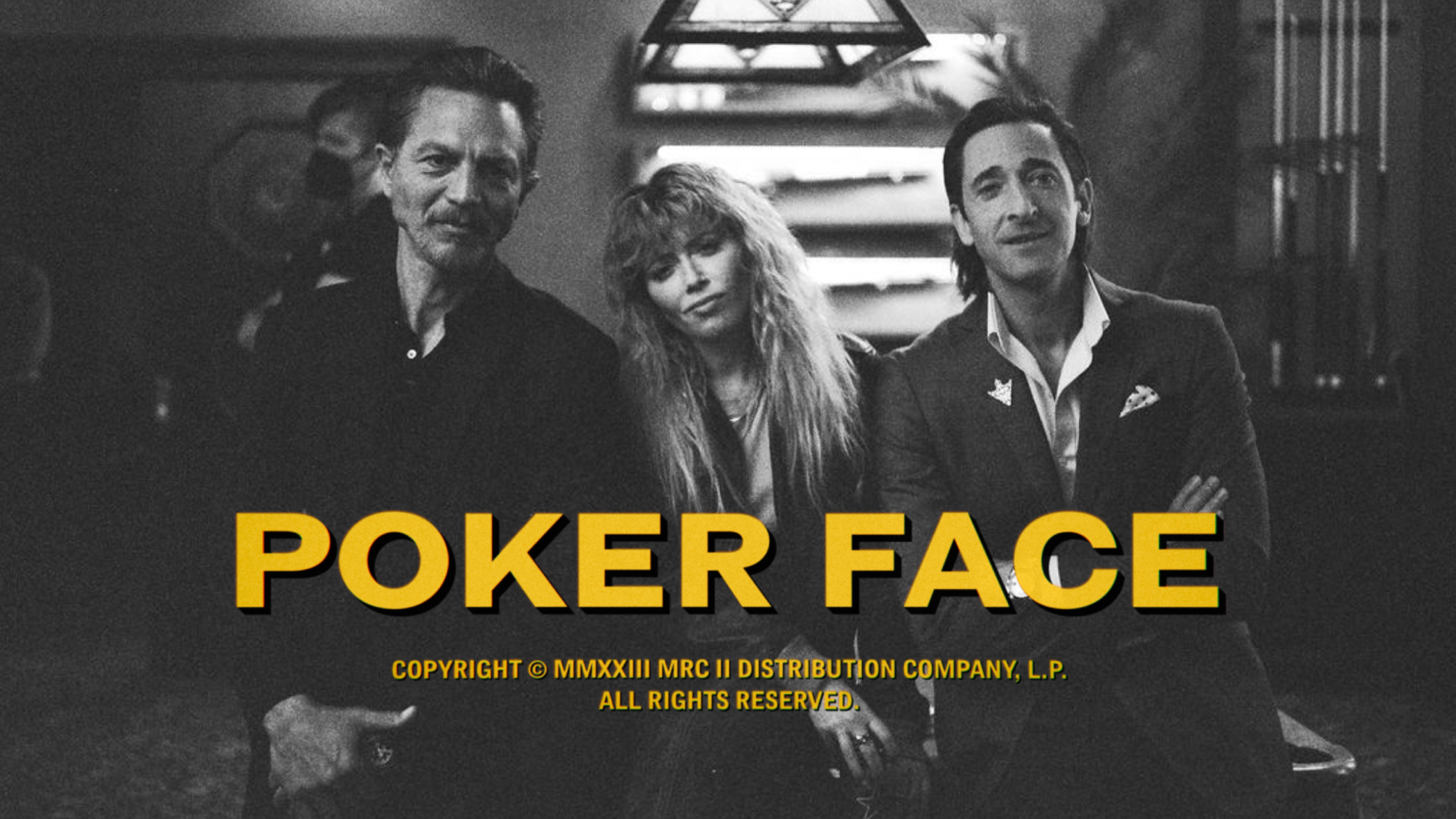
Poker Face is the new, old, case-of-the-week detective series by Rian Johnson and Natasha Lyonne for Peacock Originals.
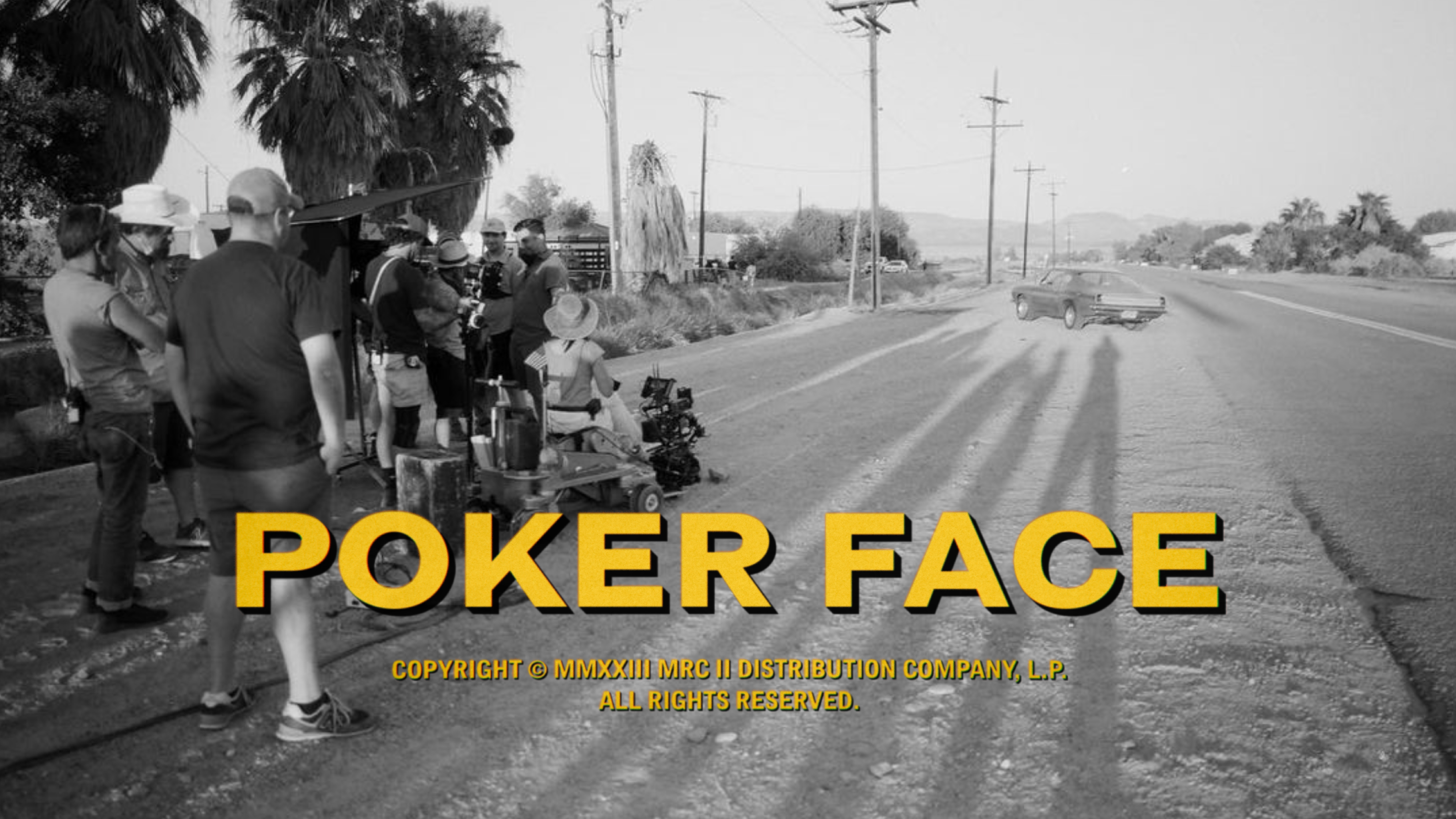
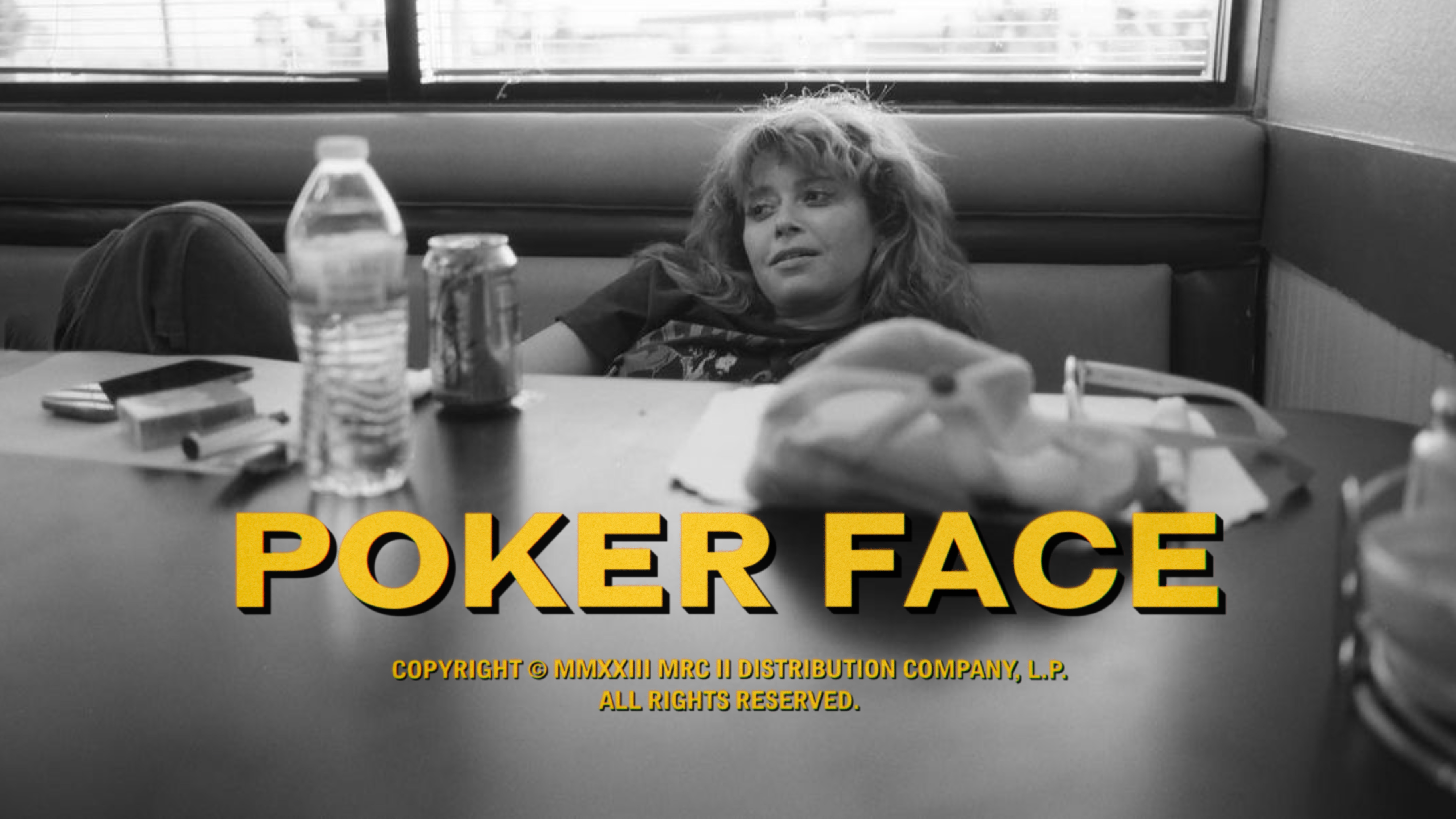
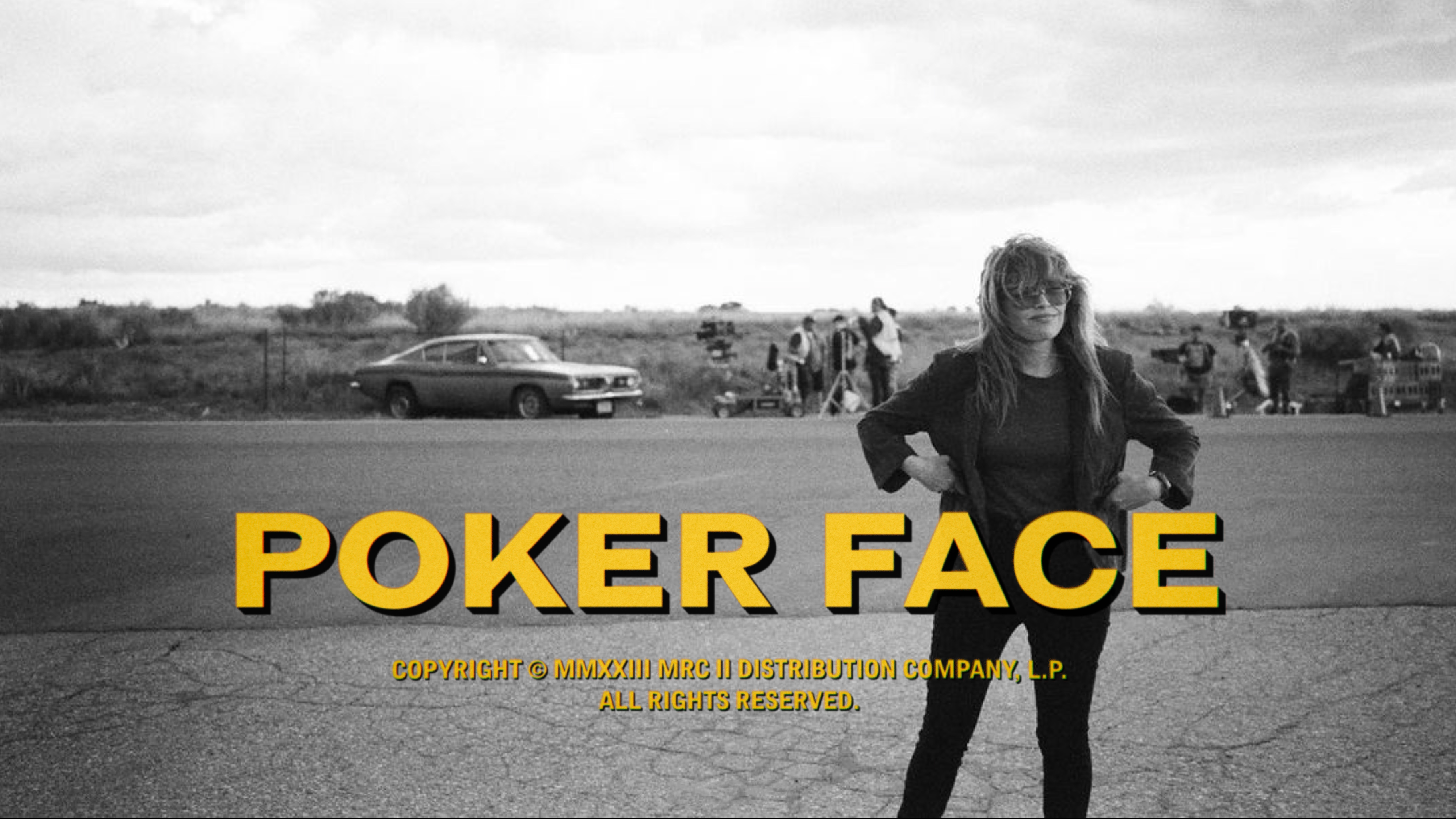
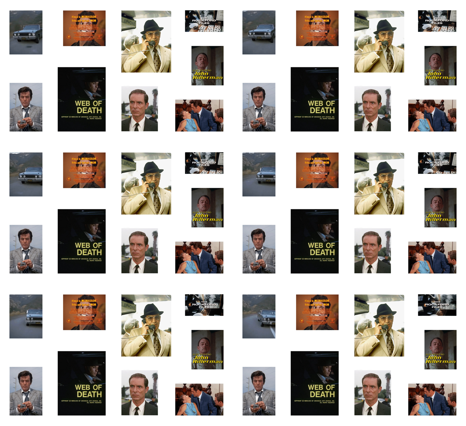
We created the title treatment for the show's worldwide marketing campaign along with the opening sequences for each episode's new case of the week.
We took inspiration from the show's genre-DNA, looking to early 70s television typography, where legible sans serifs were starkly separated from picture beneath by dark black extrusions of shadow. Our type evokes this era while also feeling completely of the moment. We obsessed over the old-fashioned optical details: grain, lens distortion, halation, and subtle drift adding a nostalgic patina over the utilitarian type beneath.
Disciplines
- Creative Direction
- Typography
- Branding


We took inspiration from early 70s television typography, where legible sans serifs were starkly separated from picture beneath by utilitarian extrusions of shadow.
We then explored a range of utilitarian typefaces that evoked this era while also feeling completely of the present moment.
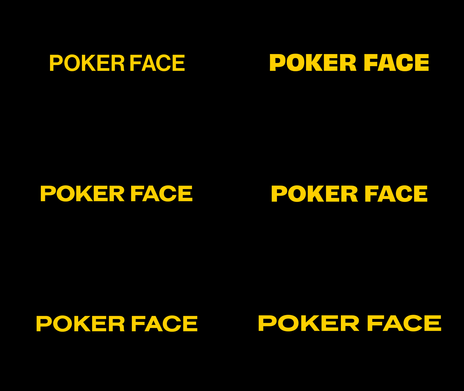
The final treatment is typeset in the Grotesque Display (MT Std Bold Extended) family, which felt like it had one foot planted in 1973 and the other in 2023


The opening title sequence arrays the titles neatly on a flexible grid that allows the titles to react fluidly to the picture beneath.


Watch it now everywhere on Peacock Originals
Credits
- Creative Direction
Marke Johnson
- Design
Davis Scruggs
- Production
Kimberly Johnson
Acknowledgments
Thanks to both Rian Johnson and Natasha Lyonne for both going to bat for these titles early on, and to everyone at Peacock, especially the post-production crew.
