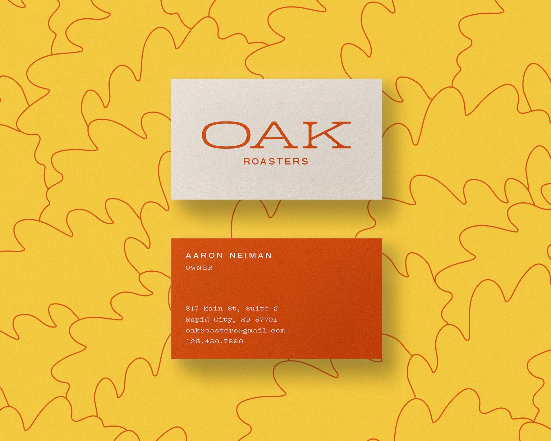
Oak Roasters
Oak Roasters is specialty coffee roasting outfit hailing from the Black Hills of South Dakota. One of few specialty roasters in the region, their high level of craft is matched only by their easy-going, up-for-anything spirit. Much like the old oaks in many communities, we created a visual identity that promotes togetherness with a strong and quiet confidence.
Disciplines
- Branding
- Visual Identity
- Packaging Design
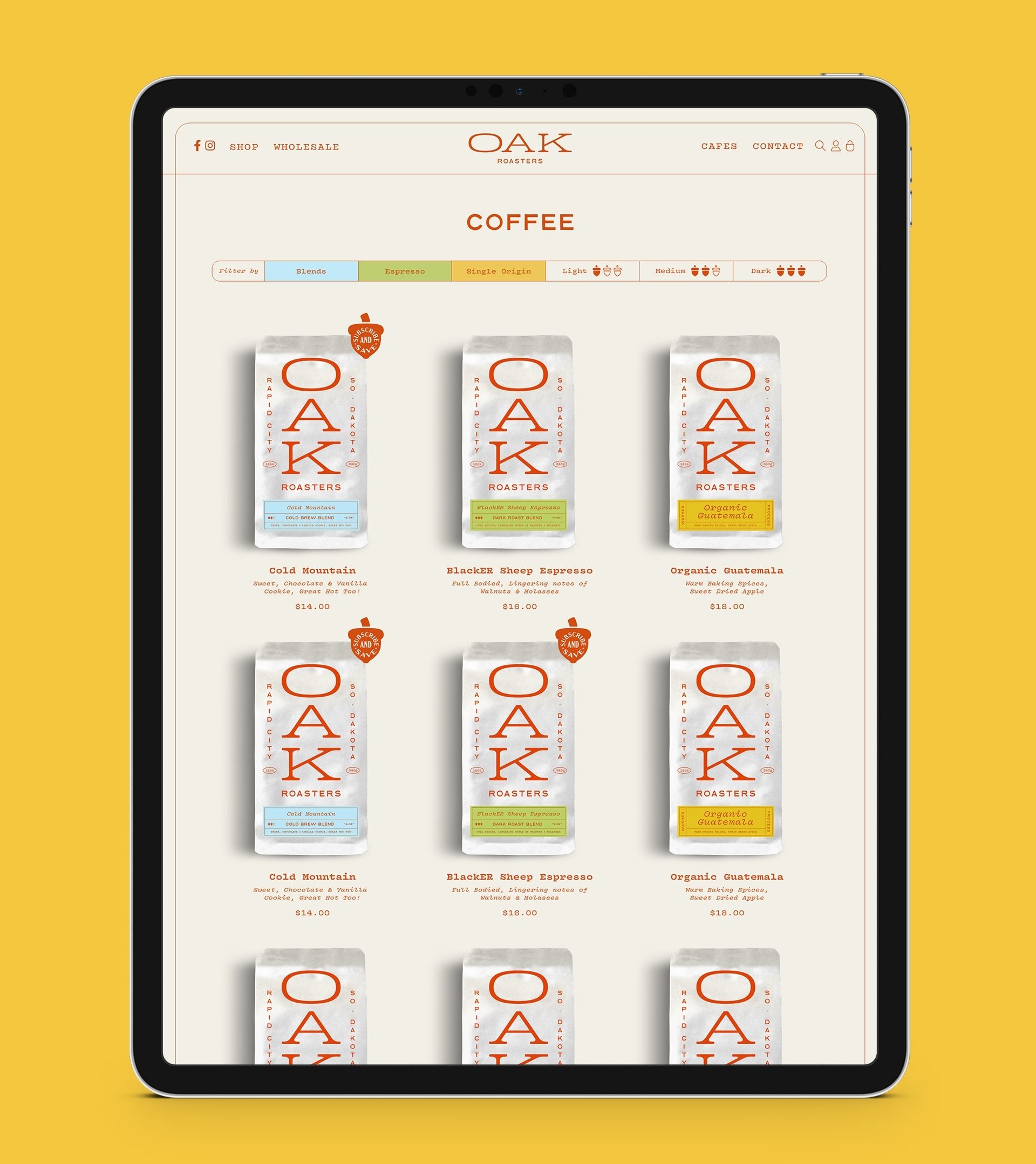
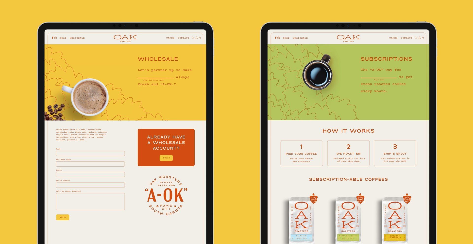
- Web Design & Development
- Merchandise
- Collateral
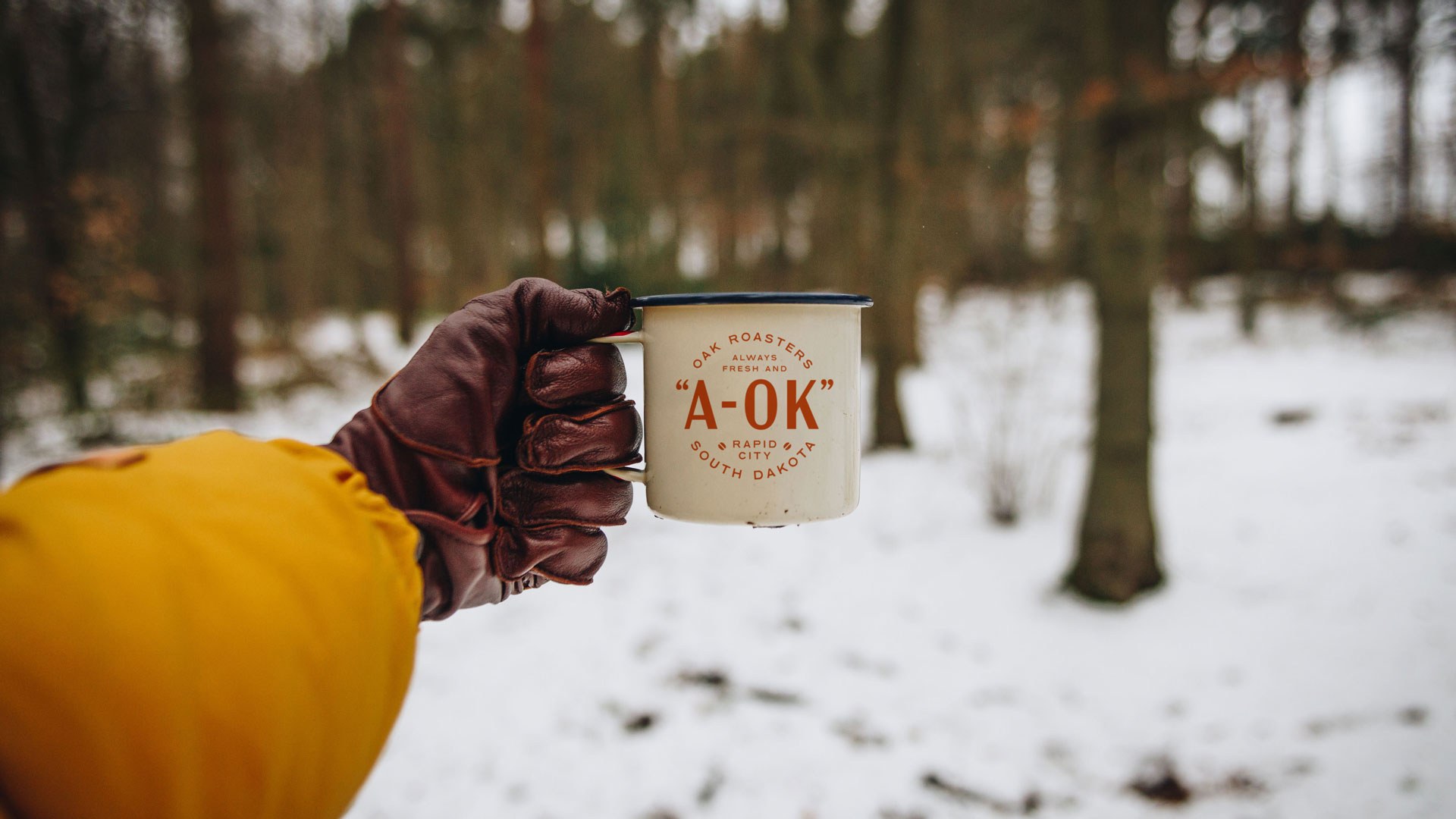
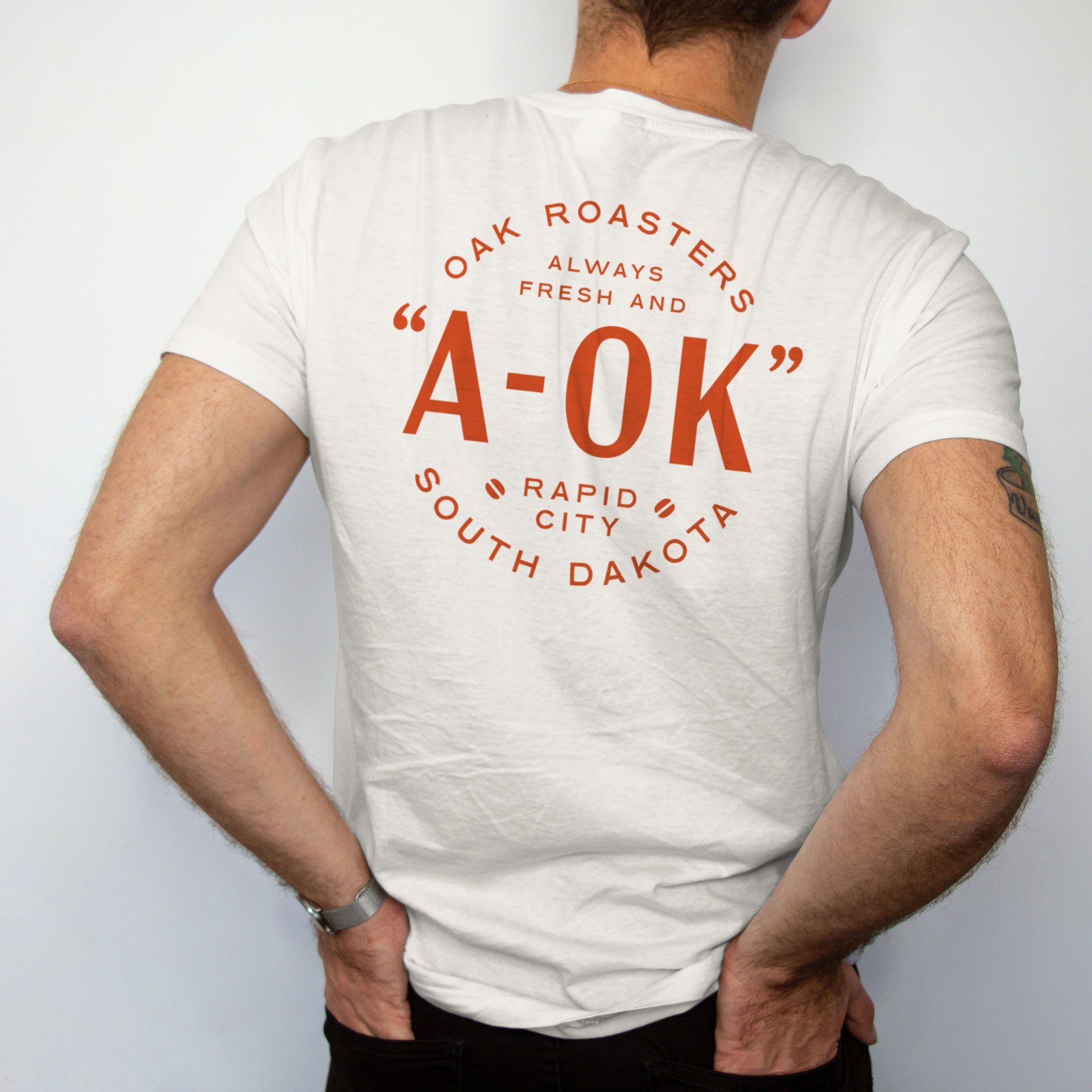
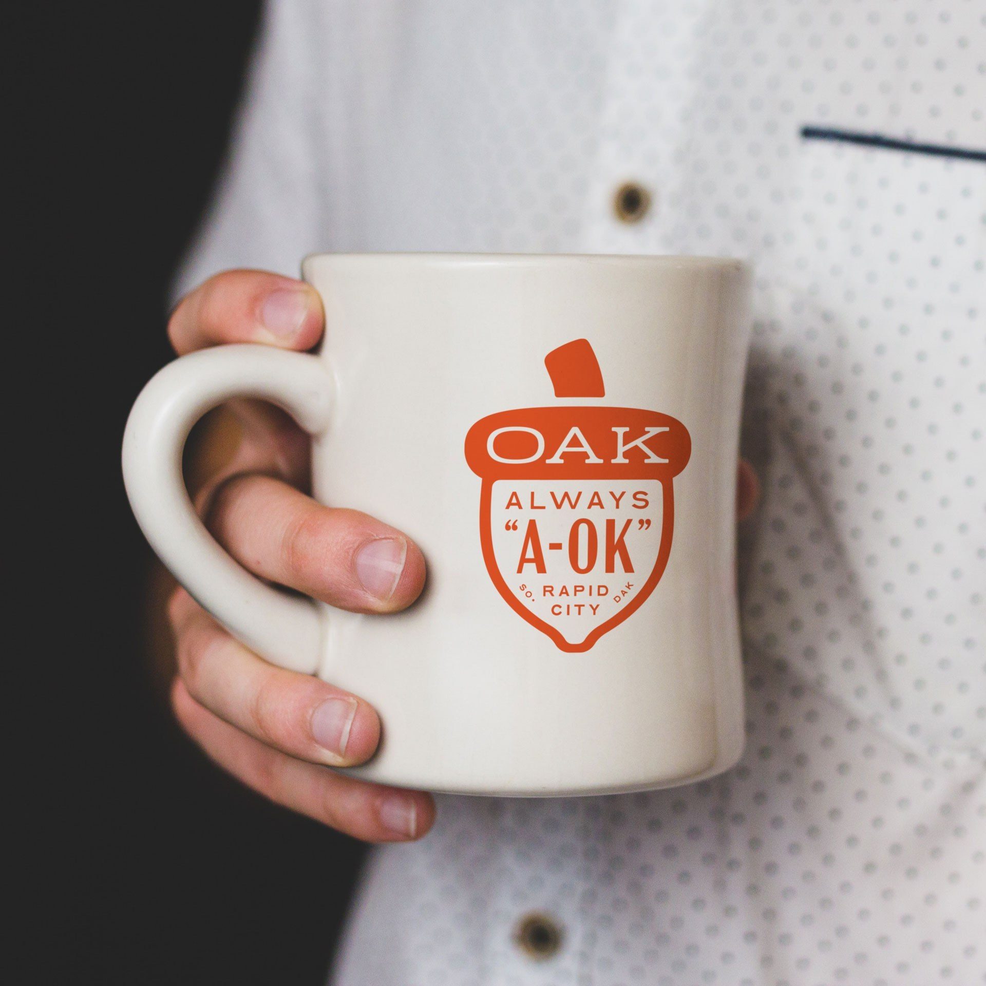
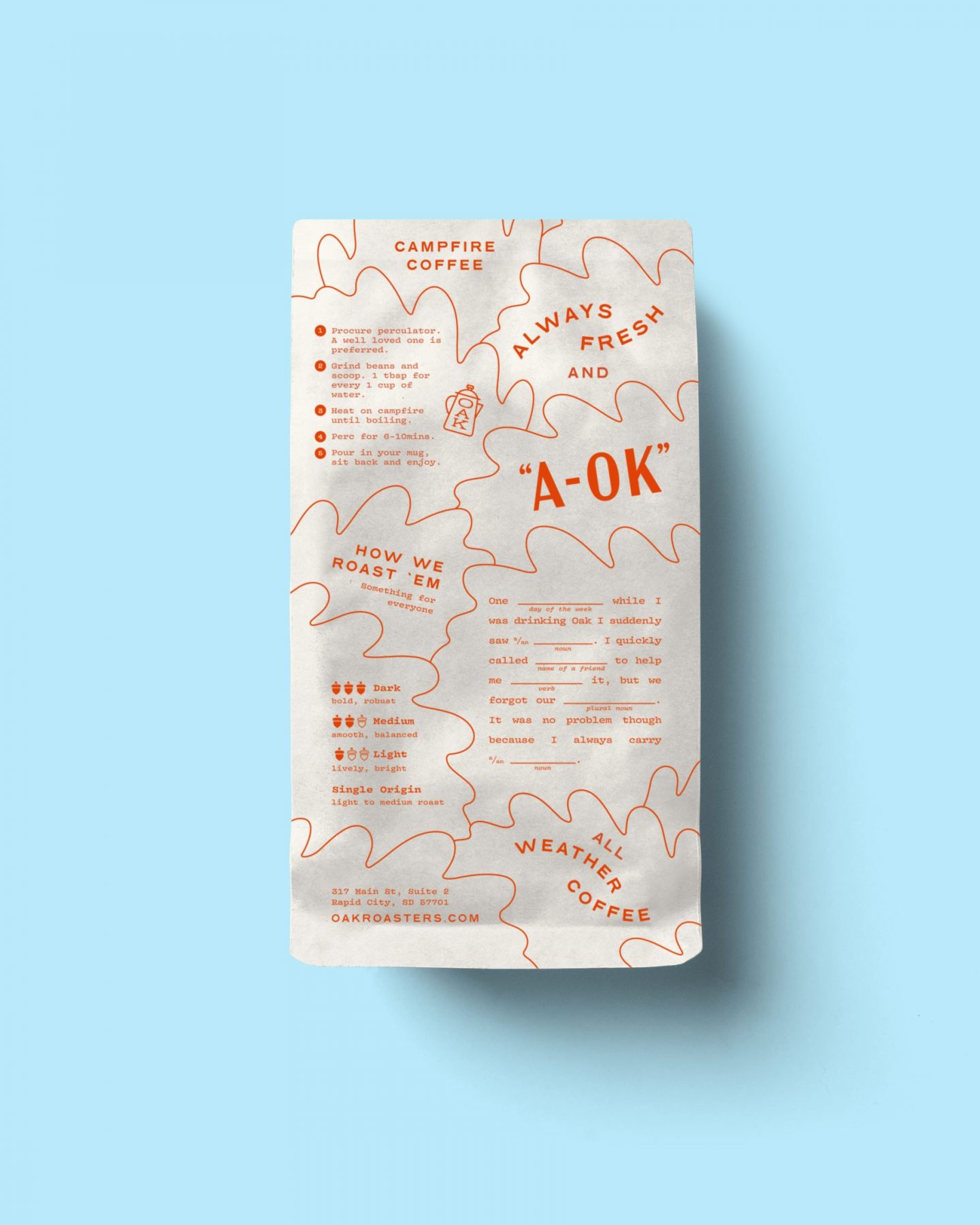
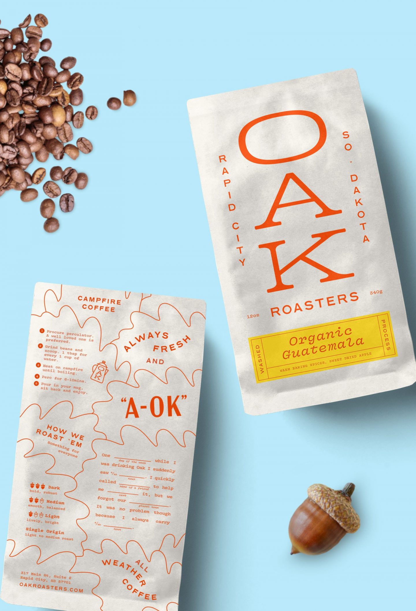
Traditionally, the "big oak" has been a central gathering place for many communities.
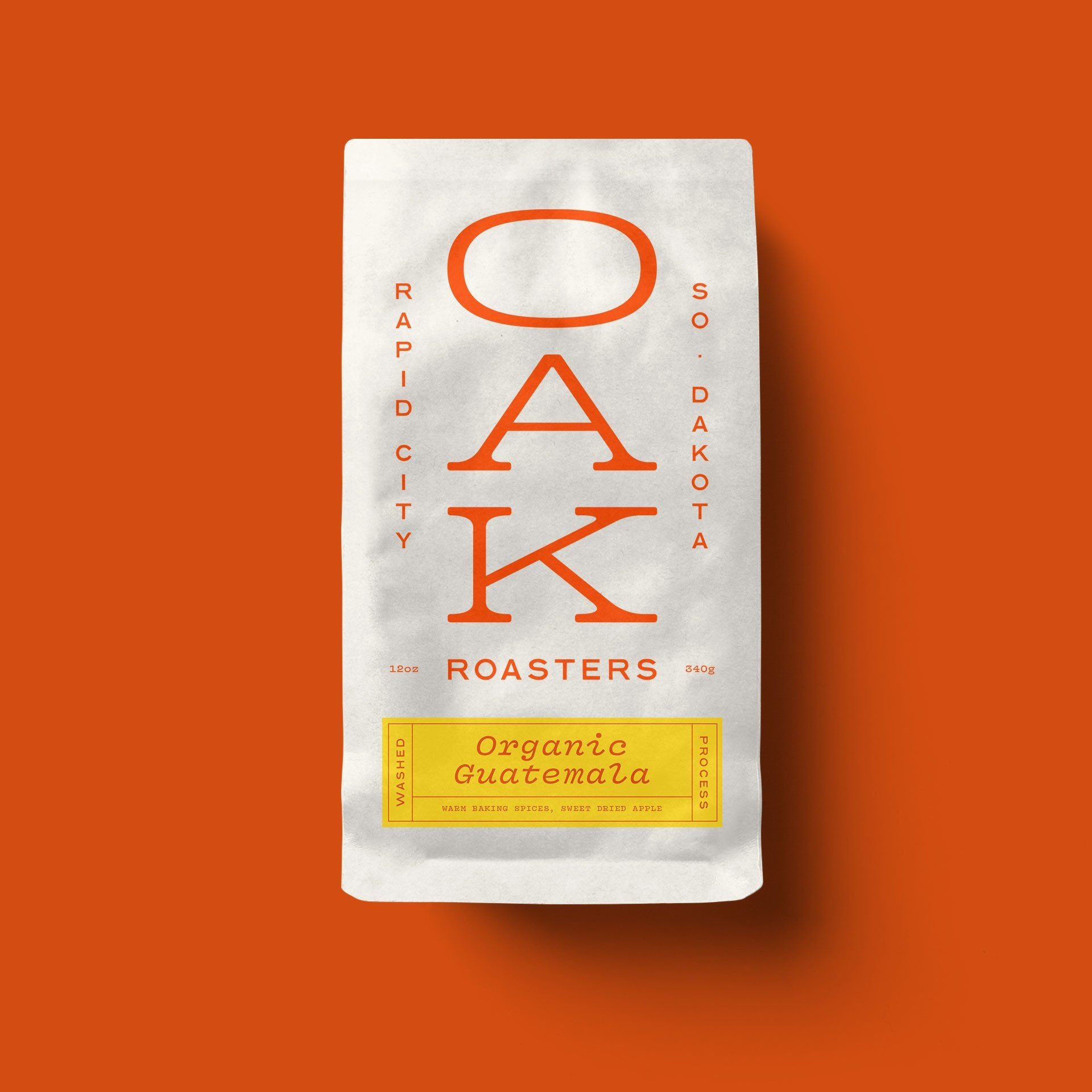
In the same spirit, the trunk-like wordmark stands tall on the bag, quietly drawing people together.
And as we were developing taglines for the brand, we realized the perfect phrase was right there in the wordmark.
The flip side of the bag is inspired by the back of cereal boxes, complete with an Oak inspired mad-lib.
Oak will be launching in late 2021 – give them a follow to find out when.
Credits
- Creative Direction
Marke Johnson, Adam Blake
- Art Direction & Design
Adam Blake
- Project Manager
Kim Johnson
Acknowledgments
Thanks to Aaron and Jarilee for their trust and taking this journey with us.