Dry Bones
Dry Bones is a long-standing community of support among Denver’s unhoused teens and young adults. They have the simple but radical belief that companionship itself can be profoundly transformative. So alongside helping to meet emotional, spiritual, and physical needs, their real work is building ongoing relationships that remind the invisible among us of their immeasurable worth.
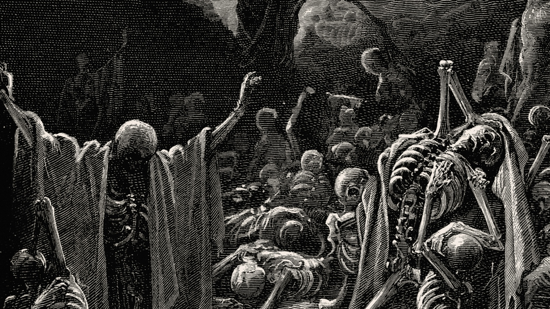
We created an edgy yet sophisticated visual identity that breaths new life into their provocative name. Inspired by Gustave Dore's gothic etching depicting God bringing dead bones back to life, we created a custom wordmark that literally grows from a smattering of typographic shards.
Disciplines
- Visual Identity
- Copywriting & Brand Voice
- Illustration
- Motion Graphics
- Web Design & Development
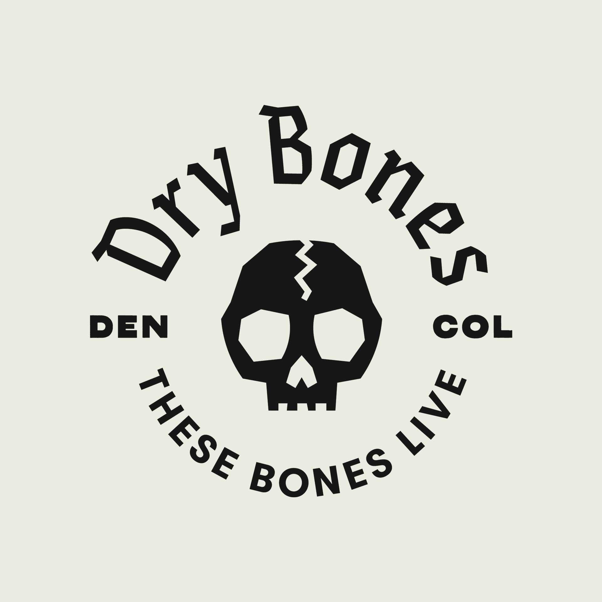
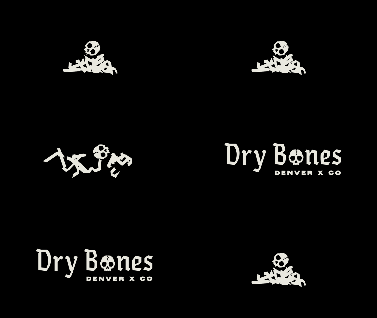
We created a custom wordmark that grows from a smattering of typographic bone shards.
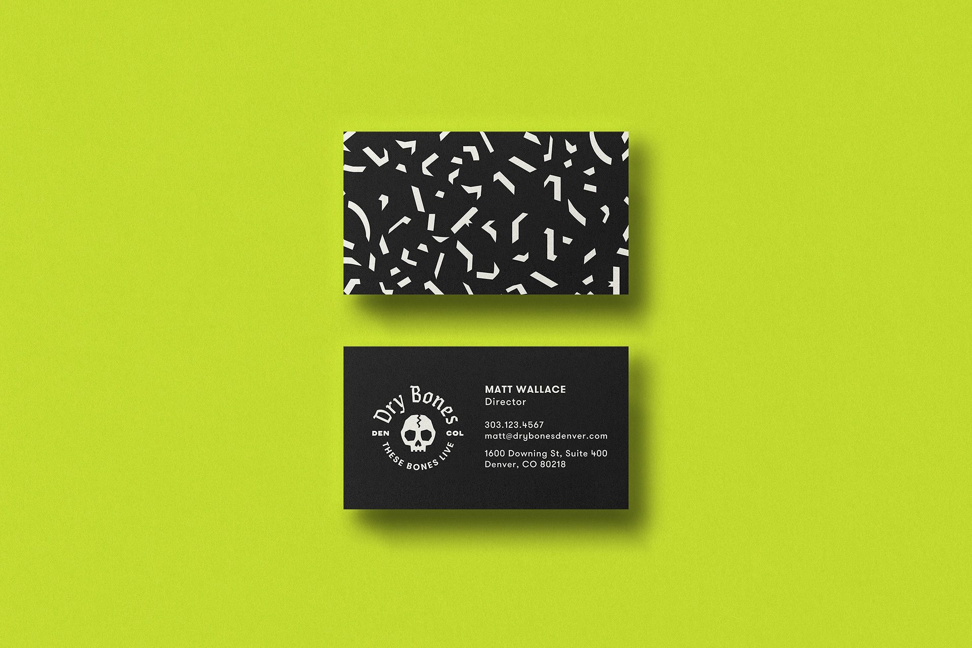
The brand needed to speak without pandering to two very different worlds: Teens living on the streets, but also legal officials and church donors.
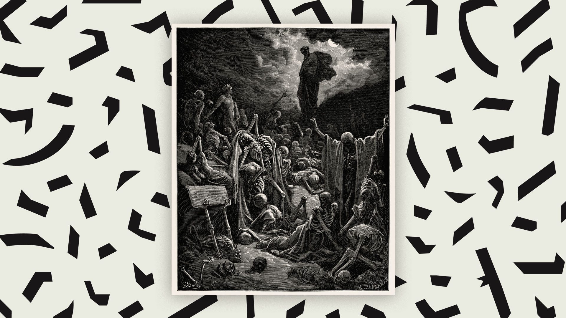
So we created an identity that could shapeshift between edgy and sophisticated...
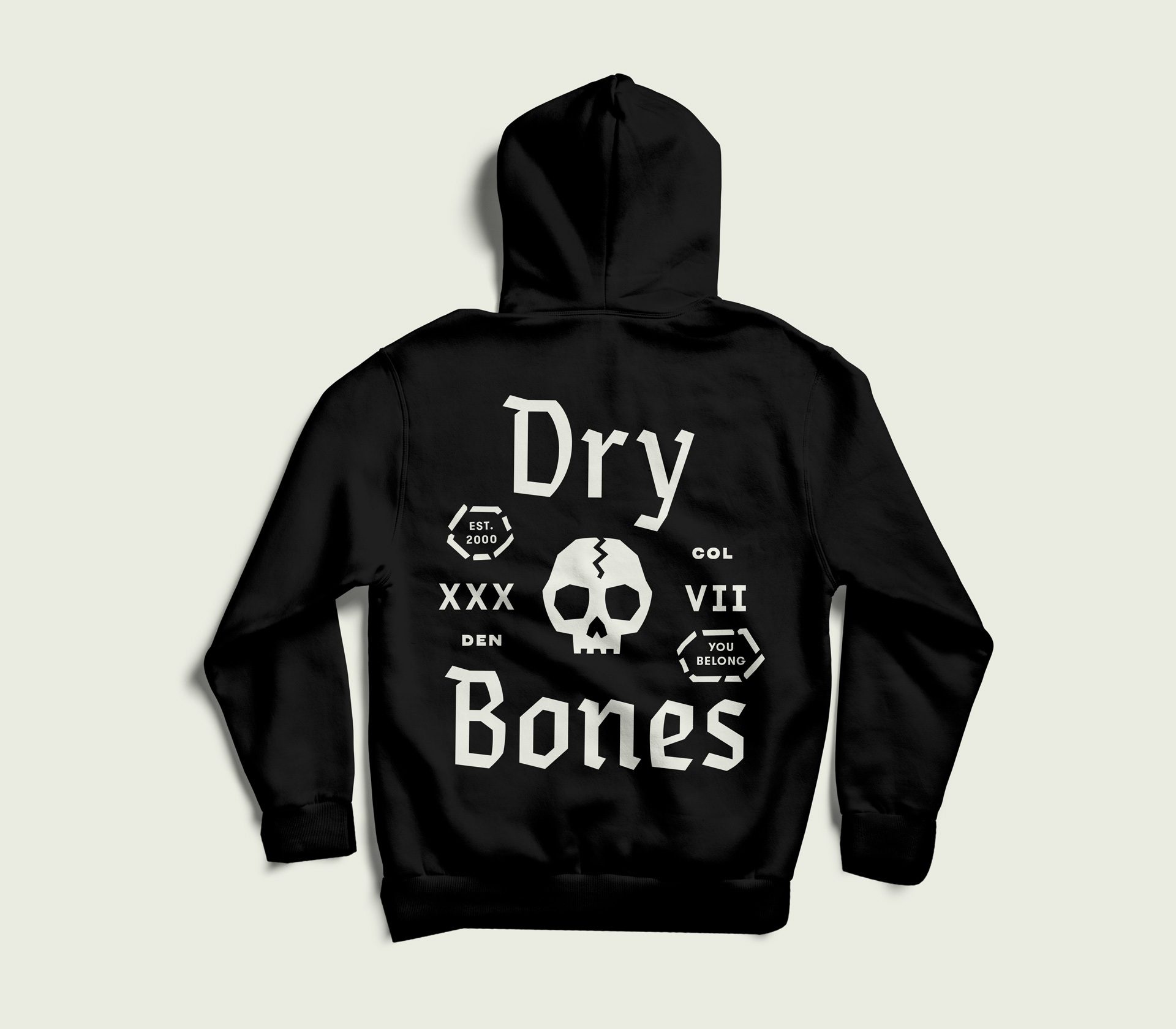
Worn with pride on a street kid's hoodie,
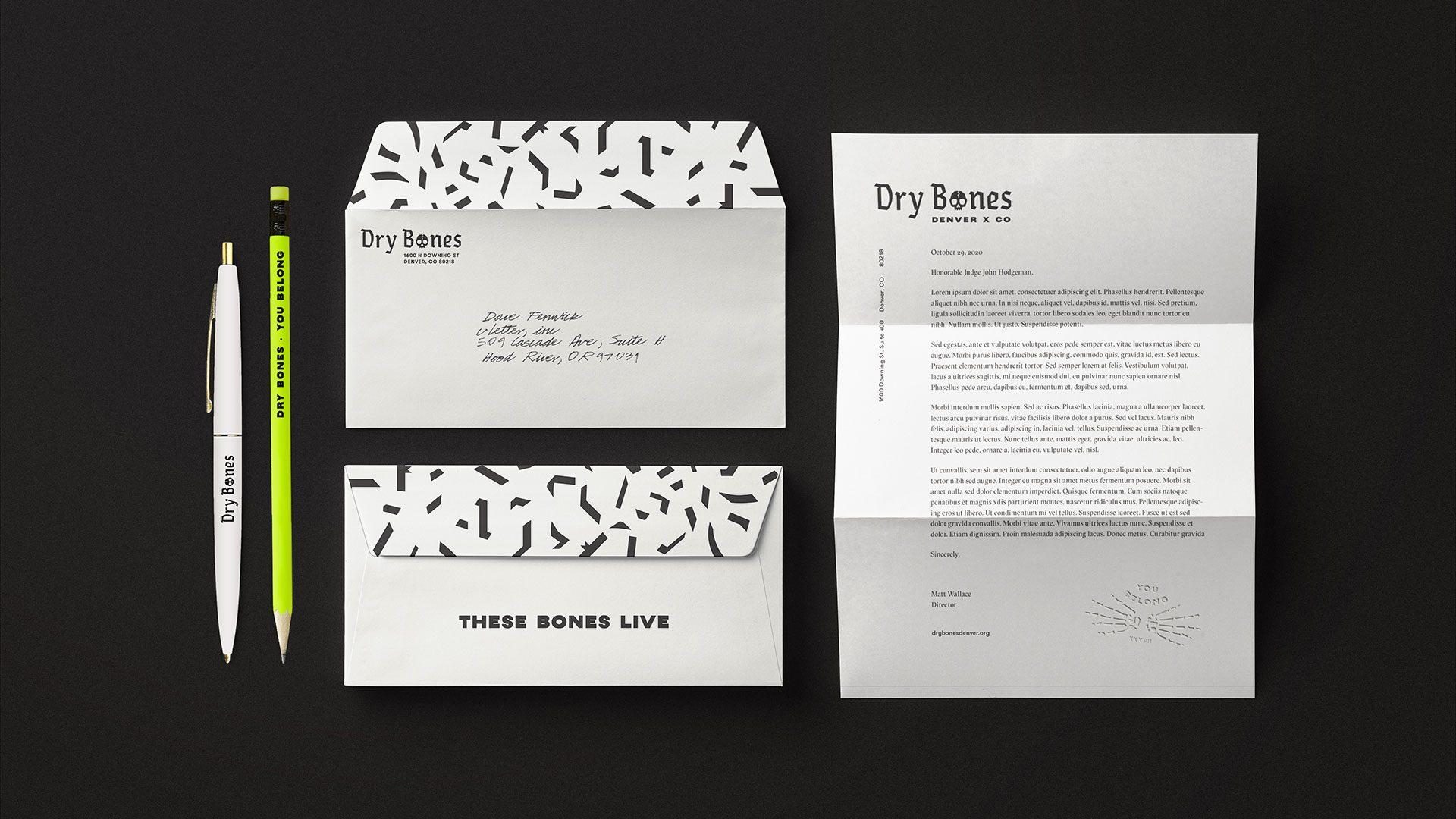
...yet taken seriously on letterhead to a judge.
We used motion to convey the brand story of new life emerging from death.
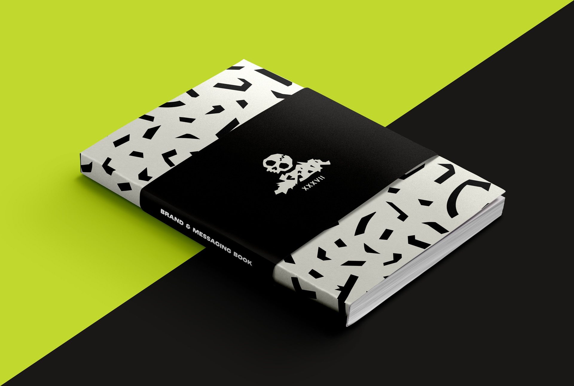
Finally we documented the identity, strategy, and messaging in a useful guide to empower both old hands and new volunteers to use the new identity effectively on their own.
Visit drybonesdenver.org to donate or volunteer.

Credits
- Creative Direction & Strategy
Marke Johnson & Adam Blake
- Design
Kyle Huninghake
- Illustration
Michelle Merlin
- Messaging & Copywriting
Marke Johnson & Adam Blake
- Project Management
Kimberly Johnson
- Motion Graphics
Marke Johnson
Acknowledgments
Thank you to Matt Wallace, Nikki Wallace, Robbie Goldman, Tami Bonner, and all the crew at Dry Bones Denver who took us around the city to meet your friends, educating us about your vital work, and embracing our work with excitement.


