Natuur
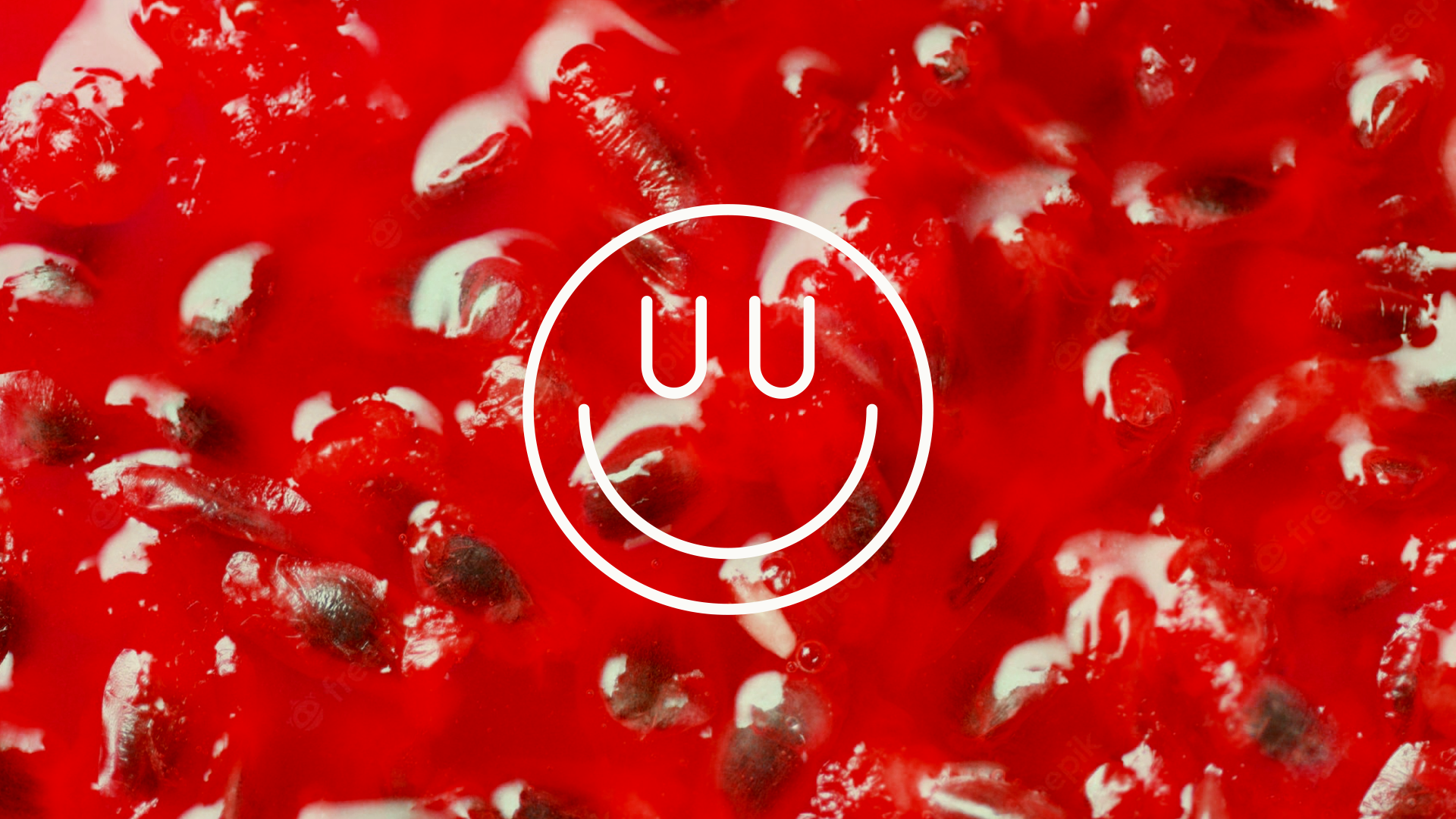
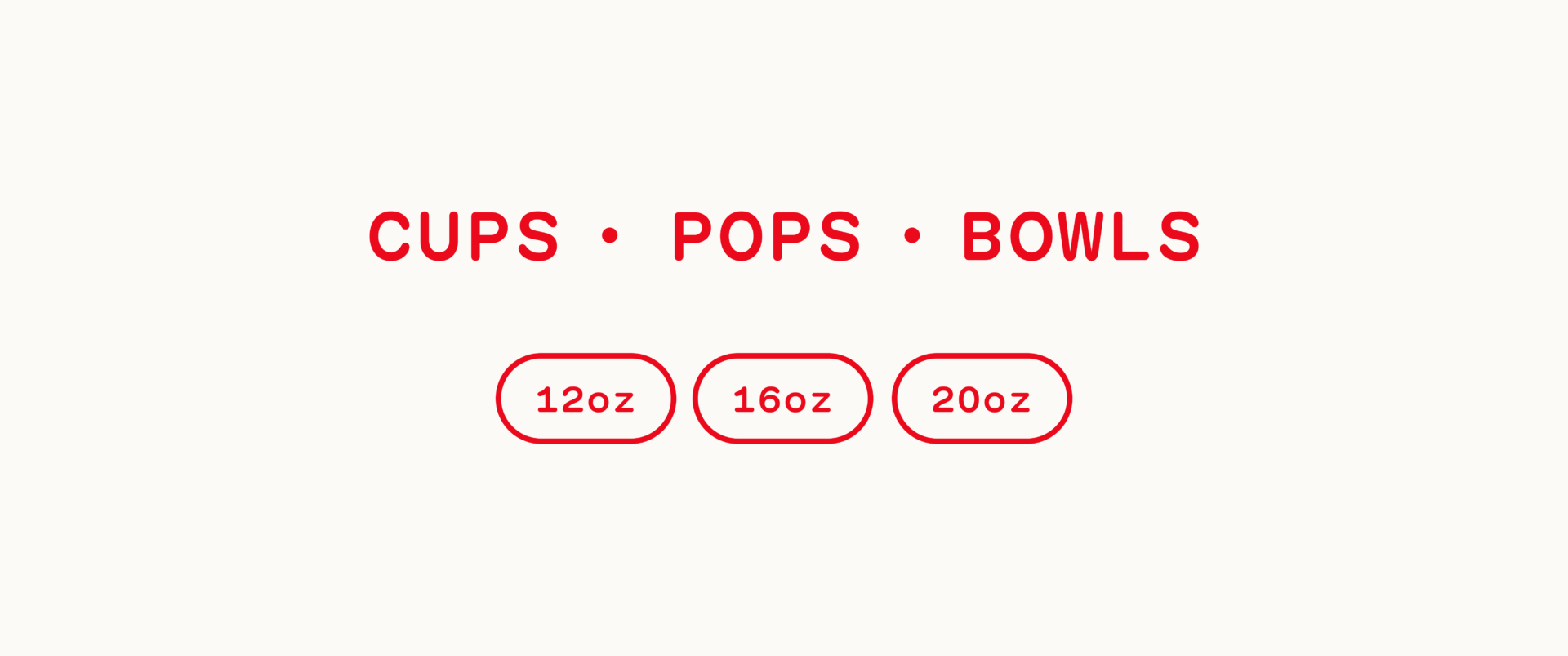
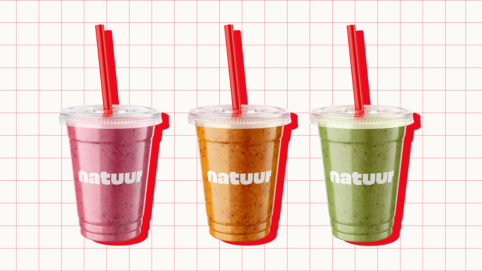
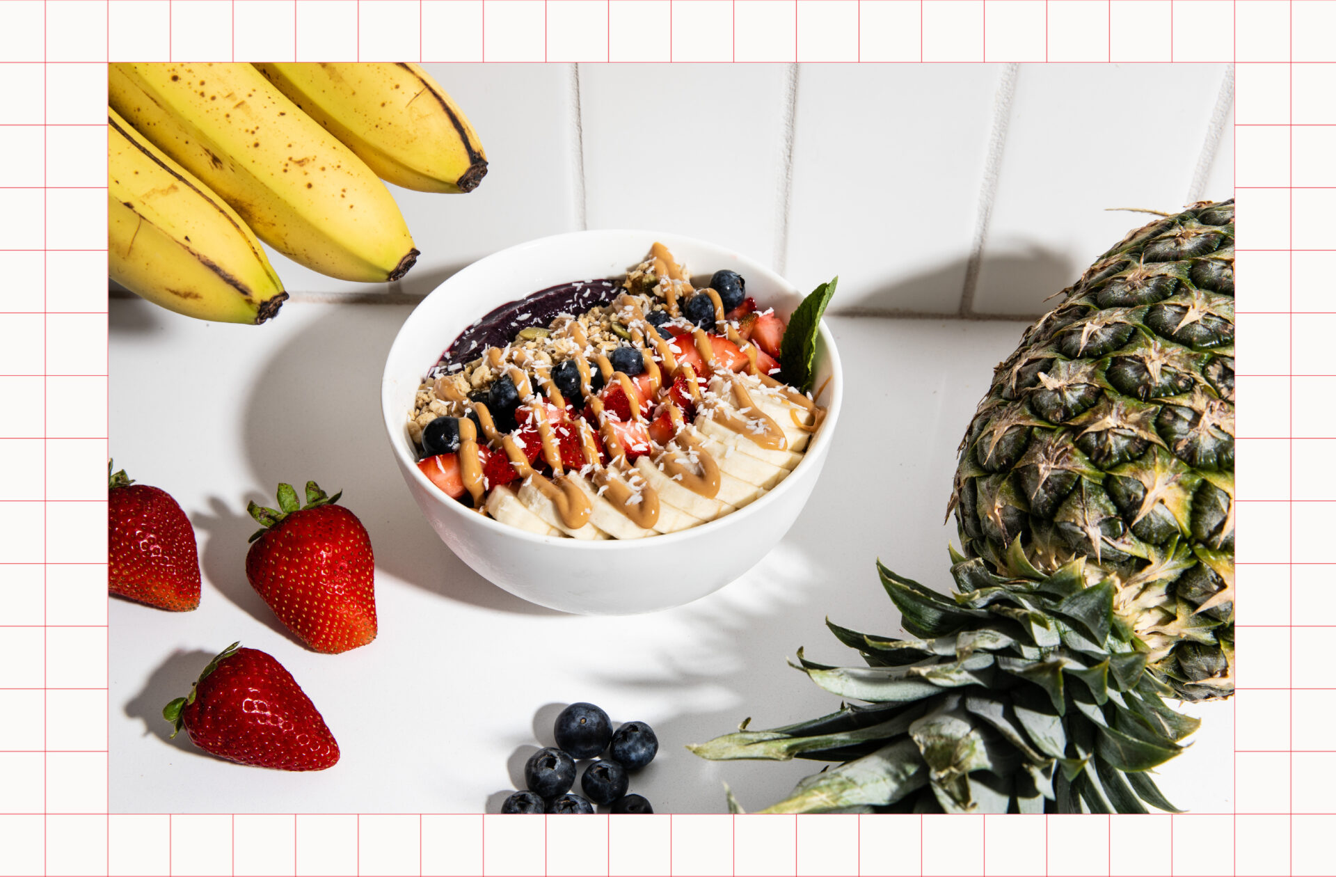
Natuur makes fresh, healthy, high-quality smoothies, bowls and pops in a bright, fun, inviting community setting.
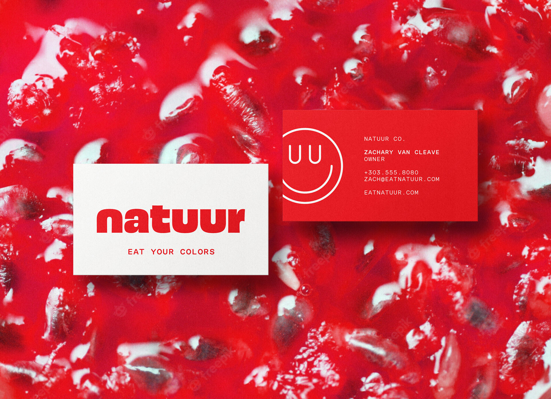
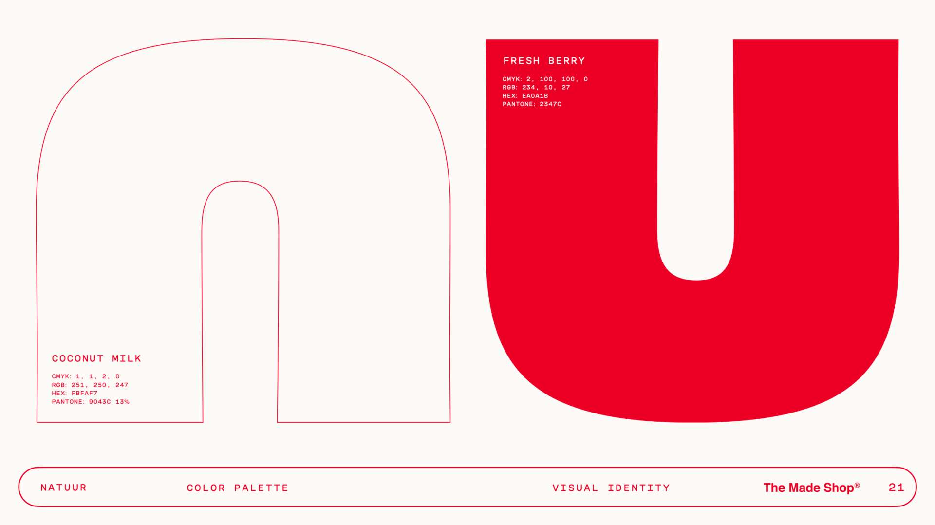
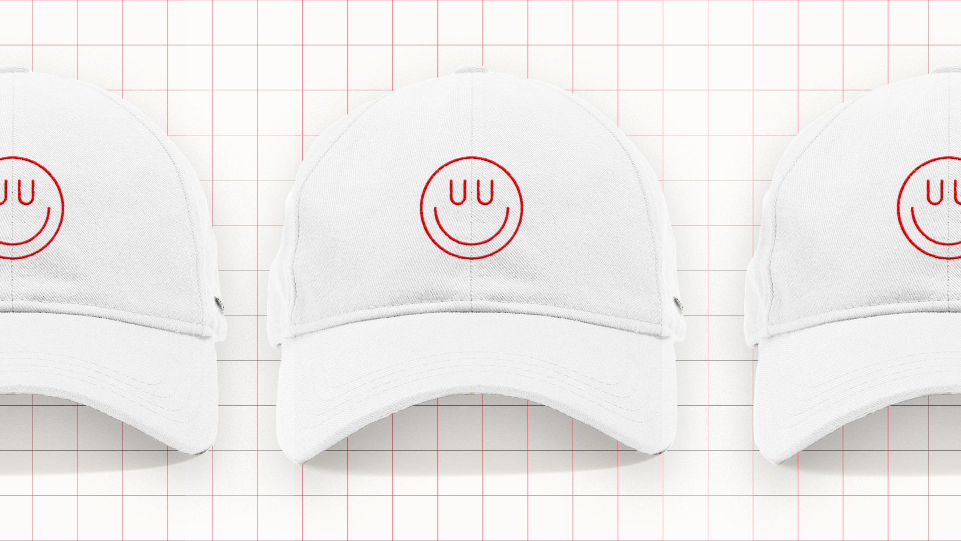
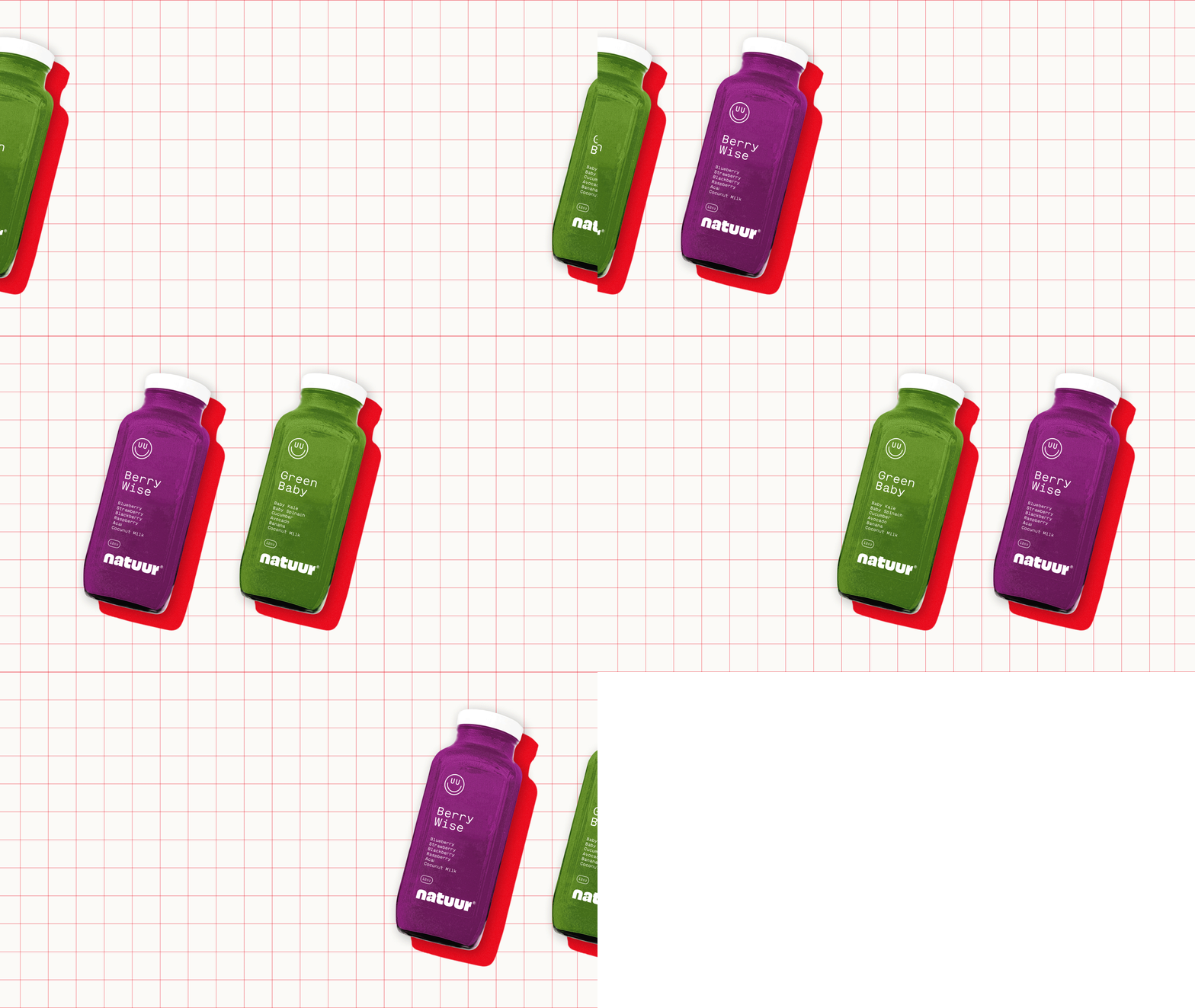
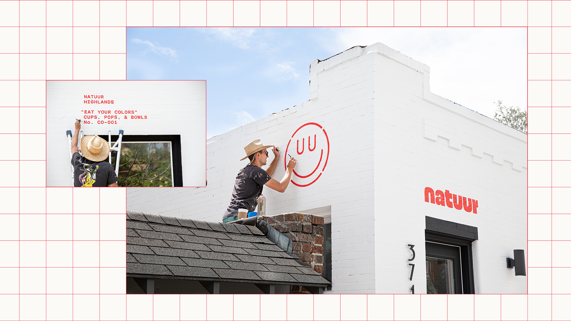
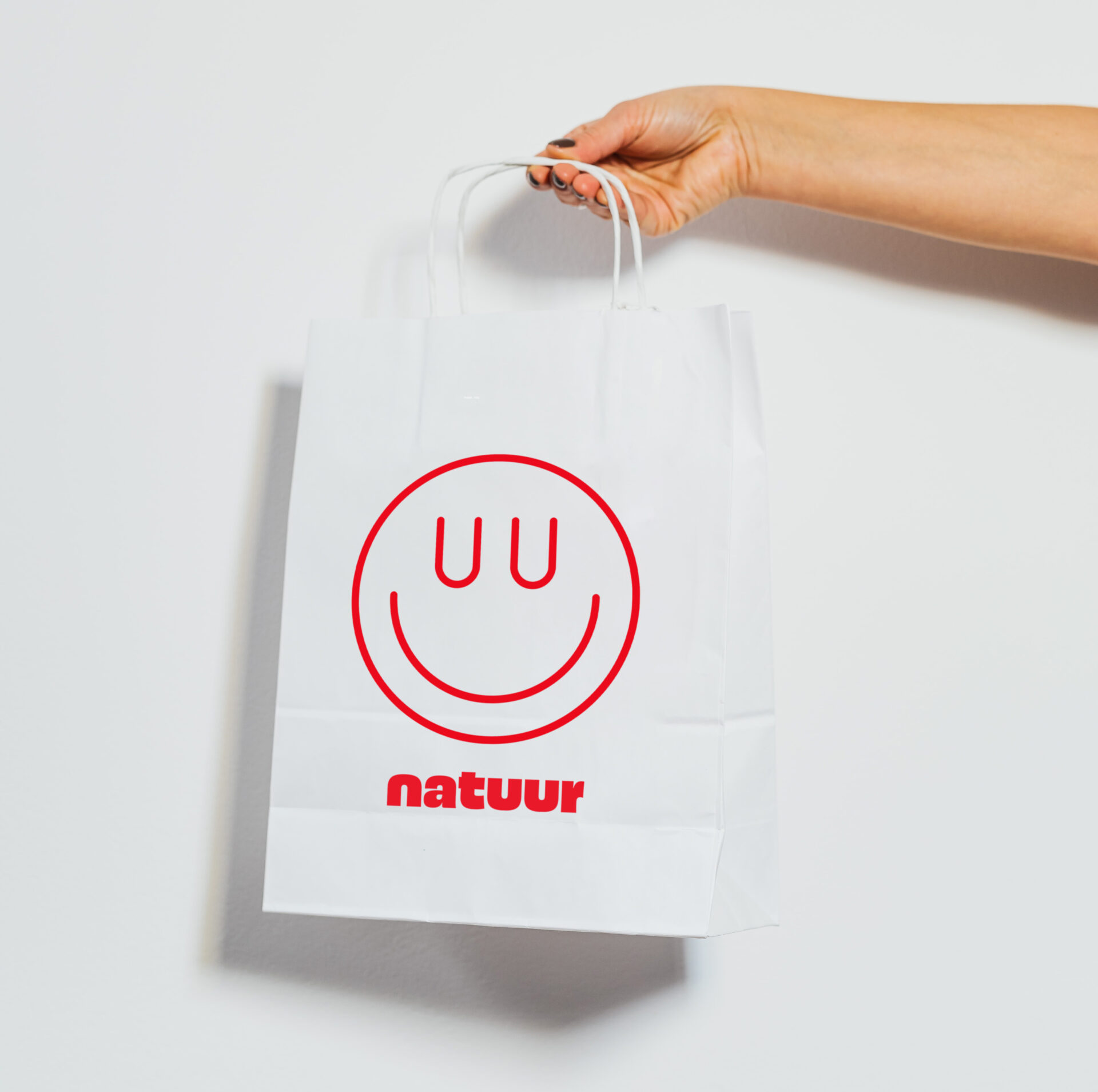
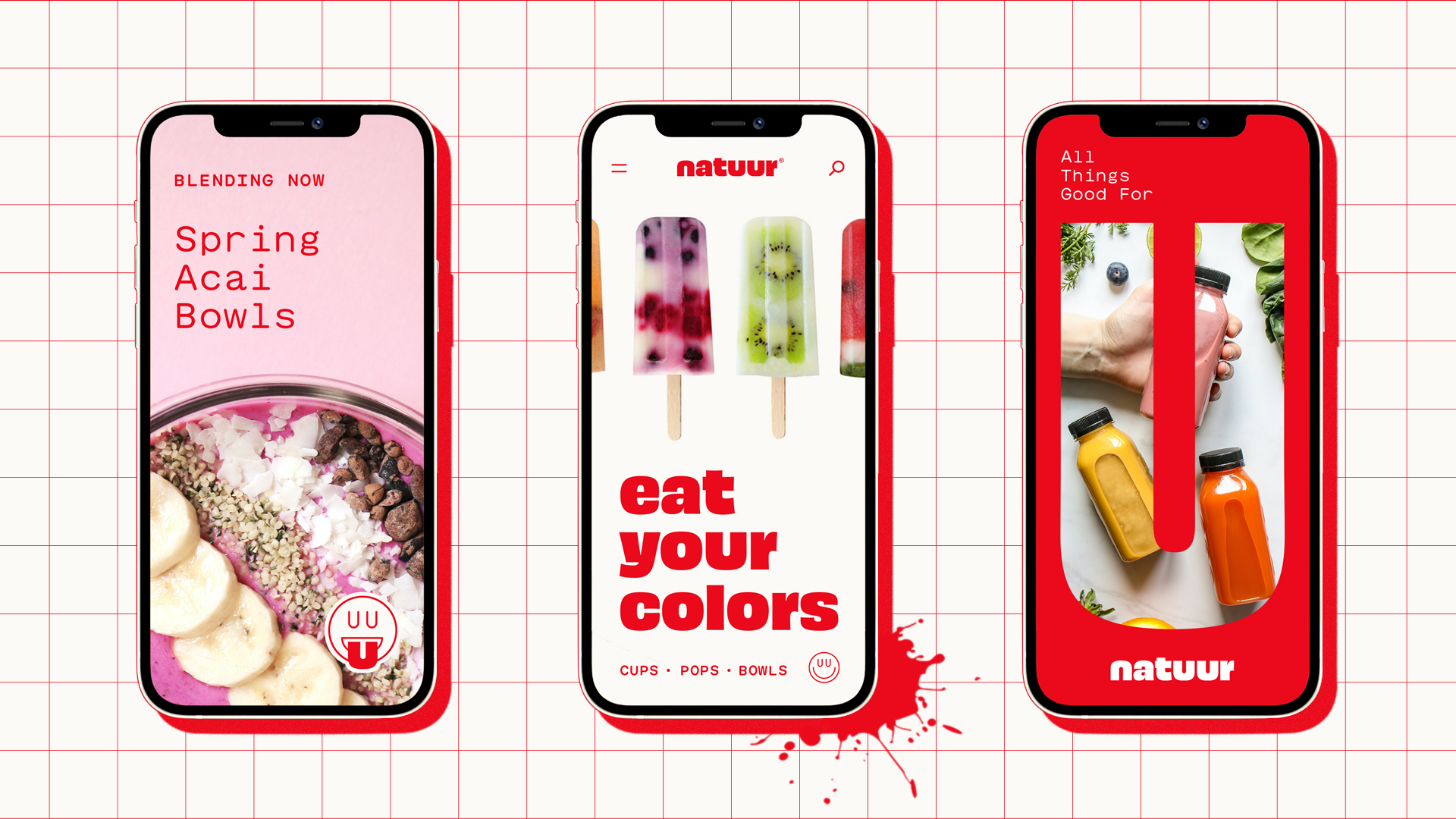
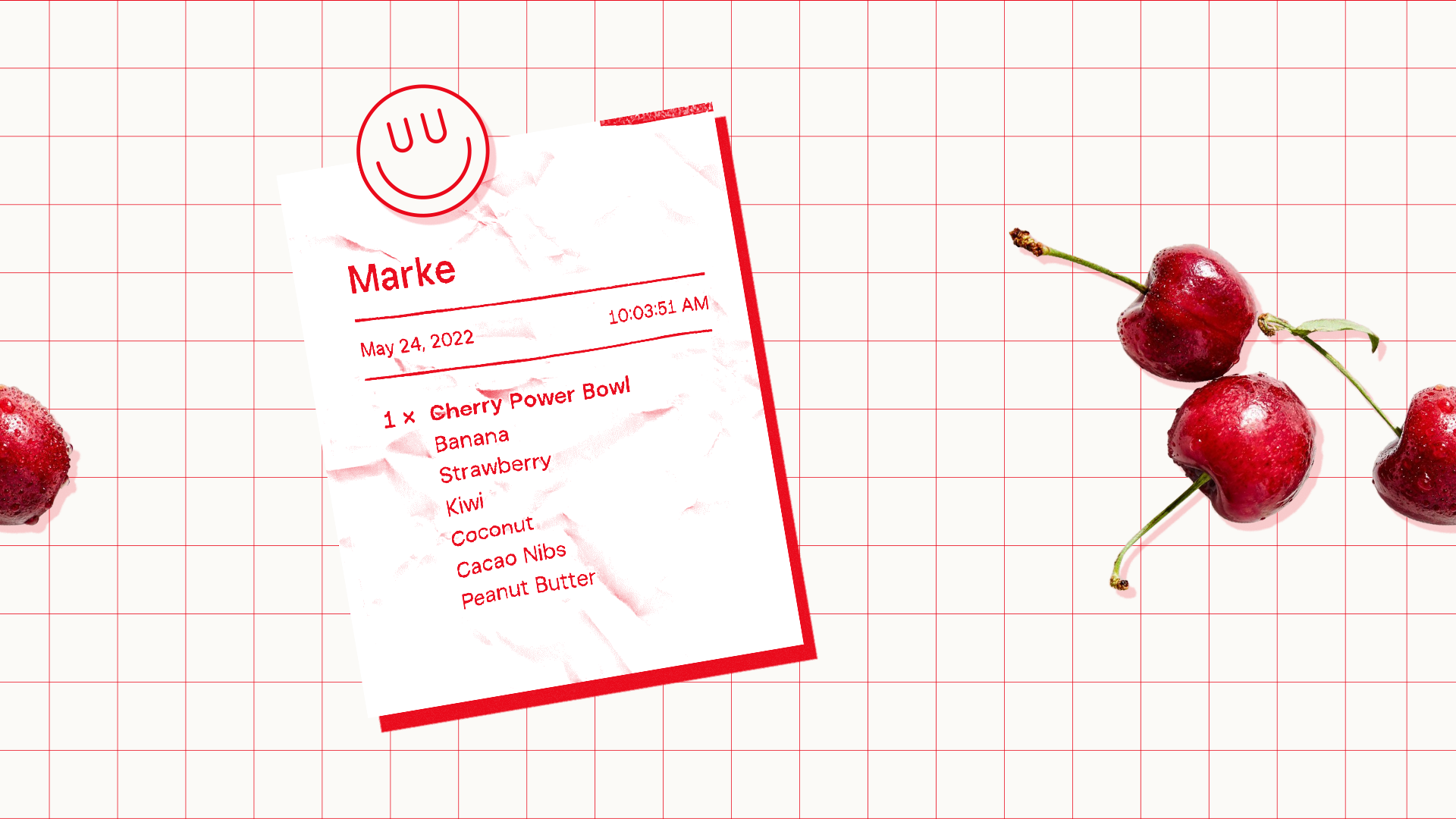
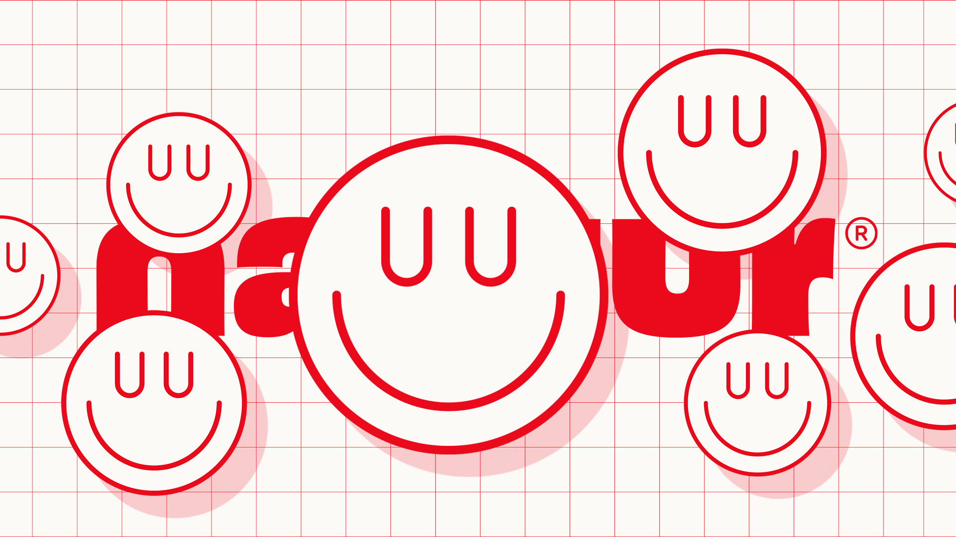
We created a fresh and clean visual identity that embraces the unique name spelling, pairing a bold, juicy custom logotype with a simple satisfied smile.
Disciplines
- Visual Identity
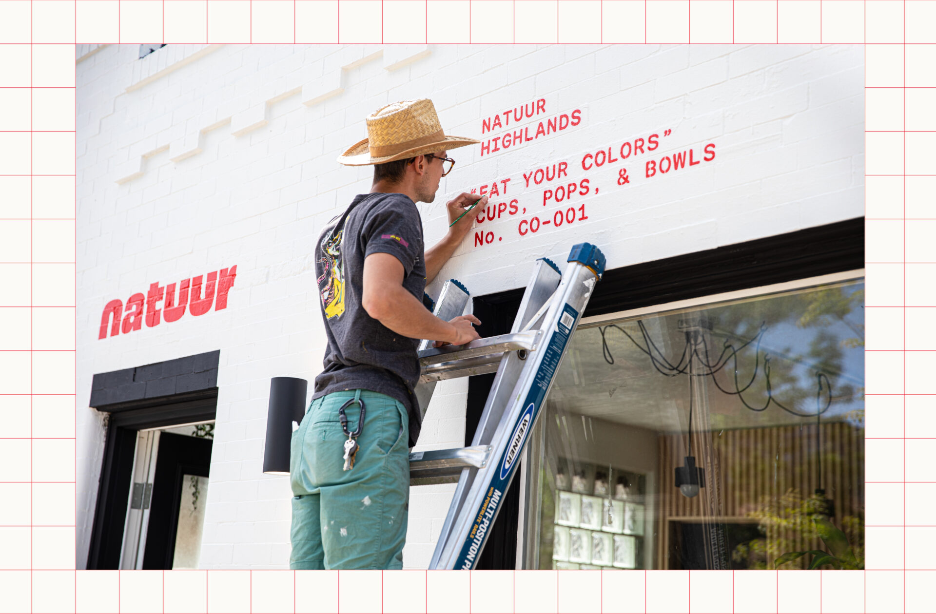
- Signage
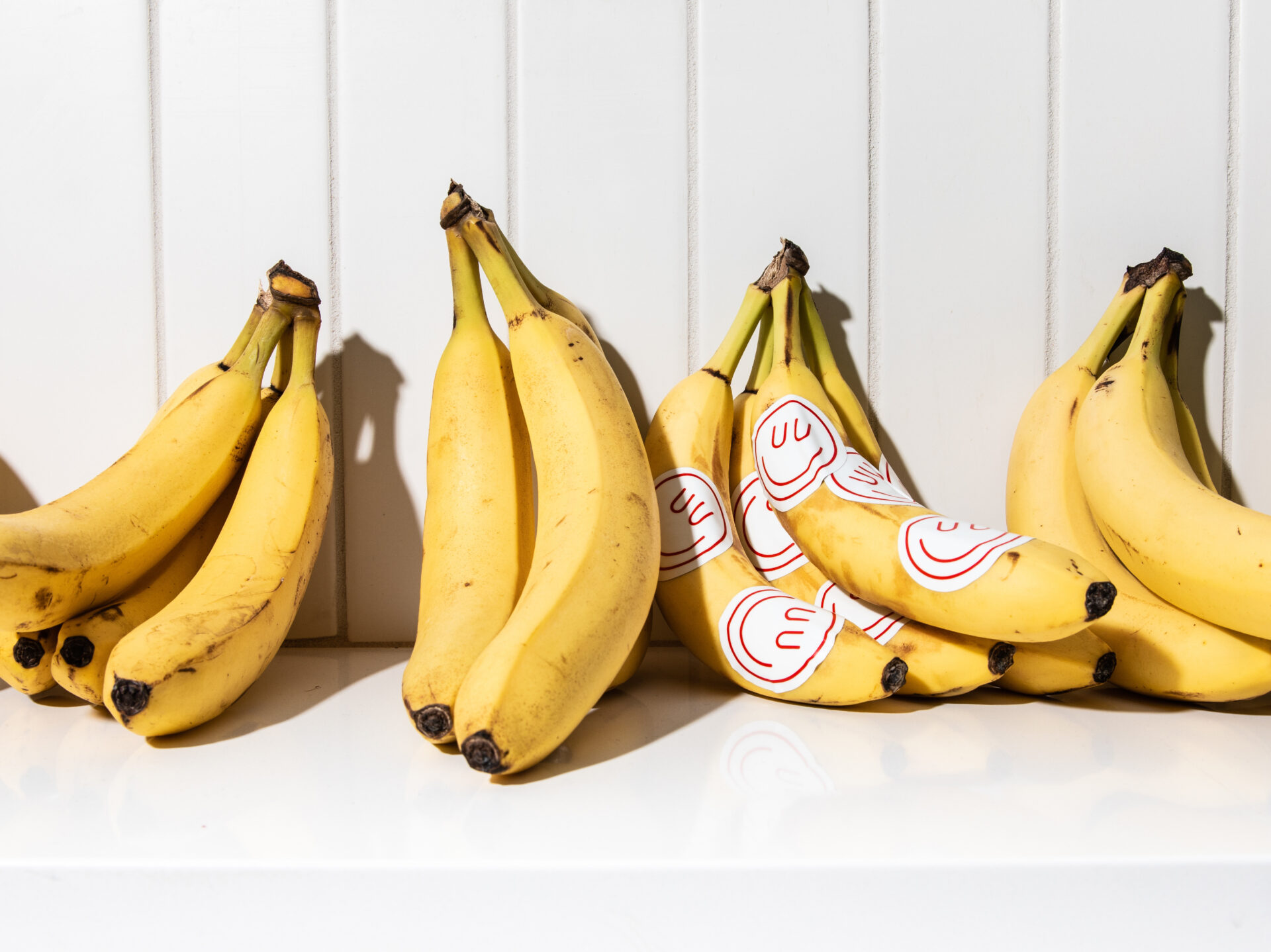
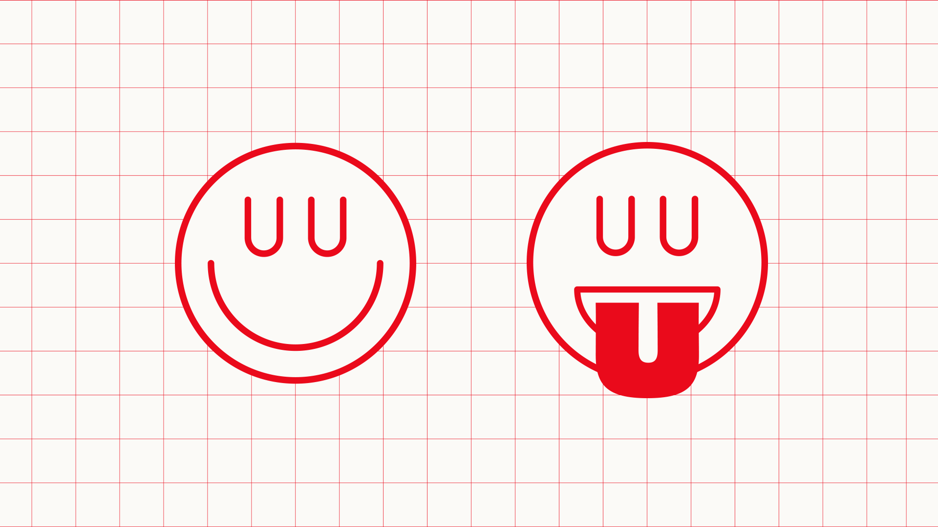
The icon is a simple, satisfied smiley (with a sly wink to Natuur's idiosyncratic spelling).

Credits
- Creative Direction
Marke Johnson & Adam Blake
- Typography & Illustration
Adam Blake
- Design Team
Davis Scruggs & Kate Petrik
- Photography
Davis Scruggs
Acknowledgments
Thanks to Zachary Van Cleave & Taylor Spradling and the whole team at Natuur for everything.